
User Interfaces (UIs) play a critical role in ensuring user satisfaction in Mendix app development. Designing user interfaces involves anticipating what users may need to do with an app and providing the interface’s elements that are easy to access, use, and understand. In Mendix app development, the user interface or user experience (UI/UX) designer’s role is to enhance an app’s usability and user experience in as many ways as possible.
Like any other development solution, there are several best practices for designing UIs with Mendix in Mendix app development. Adhering to these practices can enhance the outcome of your application, including its usability and the overall user experience. Let’s dive deeper into these best practices, shall we?
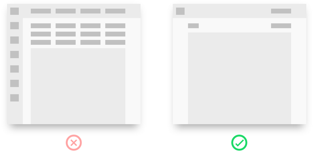
Avoid Putting Everything on a Single Screen
Putting all application buttons, features, and menus on a single screen leads to an overwhelmed user interface. In this case, UI/UX designers often start with a friendly UI and add more features, resulting in a screen with numerous buttons.
Designers that put everything on one screen often argue that:
- User hate scrolling
- It creates a general overview of the app
- Fewer clicks are necessary.
Unfortunately, putting everything in one platform is a bad practice for designing user interfaces with Mendix. The best practice is using minimal buttons on a single page because:
- It prioritizes visual proximity. With fewer buttons and features in a single screen, you can place buttons close to the data they influence. As a result, users gain visual proximity.
- It prevents an overwhelming design. Did you know your brain only understands nine options simultaneously at best? So, putting tens of buttons on a single screen will overwhelm your users. Also, end users may not use about 90% of your application’s buttons.
Avoid Putting Everything in Drop-Down Menus
Drop-down menus are a great way to pack your buttons with options. However, how you design your drop-down menus may improve or interfere with the usability of your UI. Here is a presentation of a bad and great drop-down menu:
Focus on balancing your drop-down menus to accommodate different sets of actions. Consider this scenario: an item you’re looking for is in a set of drawers. To find it, you need to start opening them one after another. If the drawers are organized logically, and in the right place, you’ll quickly find what you’re looking for. However, if the drawers have random items that do not relate to the context of what you’re looking for, you’re likely to spend more time looking for what you need.
So, a good balance in drop-down menus goes a long way. How often a service is used should determine where it is placed in the drop-down menu. So, instead of having one drop-down menu with tens of buttons, you can subdivide the buttons based on the context of what they serve and group them into multiple drop-down menus.
Visit here for: Low-Code Solutions
Let Users Know Where They Are
If your application has a consistent brand style and design system, all pages may start feeling the same to the user. Sooner or later, users will feel like “they’re walking through a forest of app pages.” In this case, they’ll be unable to recall whether they have visited a specific page before or are on a different page with similar features and states.
So, when designing user interfaces with Mendix, it’s good to create pages for distracted users. This will ensure users won’t get “lost” in your application. Some best practices to consider include the following:
- If a page flow has several steps, show them
- Give your pages clear page names and headers
- Implement breadcrumbs when you design more than one level deep
Make the Role of Each Button Clear
When designing several application pages, employ specific elements to each page to help users get oriented. Buttons should be consistent to help users take the appropriate actions based on the context of a particular page.
So, you should adequately plan each button’s position, label, and color to help users navigate your app seamlessly. For instance, if you have two buttons, “Accept” and “Reject,” you should decide which one comes on the right and left.
The rule of thumb for a button design is that if the user moves forward in an application flow, that button should be designed considering the following guidelines:
- It should be green in color
- It should be positioned on the right side of the screen
- It should have a label explaining what it does, for instance, “Proceed,” “Order,” or “Accept.”
On the other hand, if your button does a “destructive task” like canceling an activity or action, it should be designed following these guidelines:
- It should be red in color
- Be on the left
- Have a label explaining what it does, like “Reject,” “Cancel,” or “Cancel Subscription.”
Avoid Double Up Pop-Ups
Pop-ups are a great way of notifying users where they are. However, they can get uncomfortable when you press a button that opens a pop-up window with another button leading to another one, as pictured on the left.
To avoid having such pop-ups, consider the following best practices for designing user interfaces with Mendix:
- Transform the second pop-up into an inline message in your first pop-up window
- Convert the first pop-up window into a page
Use Short Lines and Visible Text
Writing long lines with tiny font sizes will get users bored. If your lines are too long, users will likely ignore the next line, interfering with your Mendix app’s usability. So, keep your lines short and with visible font such that users can easily read and find the following line.
Plan Your Forms Carefully
As a user interface designer, you must make many decisions about your forms. For instance, should they be long? Should they be broken down into several steps? How many columns would fit your screen?
Here are some best practices for designing forms with Mendix:
- Always use one column
- Consider what needs to go in drop-down menus
- Think about the story you’re telling. Look for the best points to break up your form into several pages.
Final Thoughts
Designing a user interface with Mendix is a crucial practice. It determines the usability and user experience of your application. Considering the best practices discussed can help you design a user interface that perfectly serves its users’ needs and optimizes their experience.
